

Table of Content
- What Is Swishy AI?
- Getting Started With Swishy AI
- Creating My First Animated Headline
- Making an Instagram Story Animation
- Creating Animated Charts
- Creating Logo and UI Animations
- Editing and Refining Animations
- Exporting My Animations
- What Worked Best for Me
- Limitations I Noticed
- Swishy AI Pricing and Value
- Who Should Use Swishy AI?
- Final Verdict: Would I Keep Using Swishy AI?
Animated text, product announcements, and moving graphics have become a regular part of my social media content work. I usually prefer tools that let me create these assets without spending too much time adjusting keyframes and transitions.
Swishy AI caught my attention because it turns written instructions into editable motion graphics. I spent a week using it for social posts, typography, charts, and interface animations. Some outputs were ready with minor changes, while others needed more editing than I expected. Here is how it worked in my content workflow.
What Is Swishy AI?
Swishy AI is a browser-based animation generator that creates motion graphics from text instructions. It supports kinetic typography, logo reveals, animated charts, social media graphics, interface elements, and short promotional sequences.
Unlike conventional AI video generators that produce a finished video clip, Swishy focuses on designed animations with editable elements. I could modify text, colors, timing, and other supported properties after generating a scene. The platform also has an extensive template gallery. It includes animated social media cards, notification effects, follower counters, title reveals, and data visualizations.
What interested me most was the combination of AI generation and editing. I wanted to create graphics that could be used directly in social posts or added to existing videos, rather than produce complete AI-generated videos from scratch.
Getting Started With Swishy AI
I opened Swishy in Chrome on my desktop and started by exploring the template gallery. The main creation field appeared near the top, with categories underneath for different animation styles.
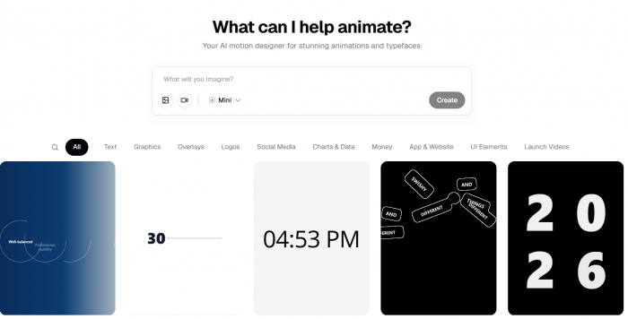
The interface was fairly easy to understand. The available categories included Text, Logos, Social Media, Charts & Data, UI Elements, and Overlays.
I spent some time browsing the examples before generating anything. The gallery had more variety than I initially expected, including animated text effects, messaging interfaces, and numerical counters.
How I Created Animations
My general workflow involved five steps:
1. Opened Swishy and selected an animation category relevant to my content.
2. Entered a prompt describing the text, colors, movement, and intended visual style.
3. Generated the animation and watched the complete preview.
4. Opened the editor to correct timing, colors, or individual elements.
5. Exported the finished animation in a suitable format.
I also opened existing templates and replaced their default content. This was particularly useful for chart animations and interface graphics because the basic movement was already established.
I found the desktop interface more comfortable than a mobile workflow would have been, especially when adjusting scene elements and reviewing animation timing.
Creating My First Animated Headline
I started with kinetic typography because animated headlines are among the graphics I use most frequently for social media content. I wanted a short opening animation with a dark background, prominent typography, and a clear sequence of moving words.
Prompt I entered:
"Bold kinetic title that reads 'CREATOR ECONOMY 2026', words snapping in one at a time with a soft blur, dark background, electric blue accent."
What Swishy Generated
The first animation was surprisingly close to what I wanted. The words appeared individually with a snapping movement, and the soft blur created a smoother entrance rather than an abrupt appearance.
The timing between the initial words looked intentional. However, the pause before "2026" appeared was slightly longer than I preferred.
I opened the editor, adjusted the accent color, and made a small duration change. I also revised the instruction to tighten the gap before the final word appeared.
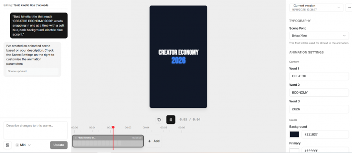
The entire generation took approximately 30 seconds, excluding my adjustments. The result was suitable for a short video opening. The text remained readable, the movement did not overpower the message, and the ending looked clean.
My observation: Swishy handled short, clearly sequenced typography particularly well. The first result needed only minor corrections, although the timing was not completely accurate.
Making an Instagram Story Animation
After the headline, I moved to a social media format with more visual elements. I wanted an animated Instagram Story announcing an upcoming launch. The graphic needed vertical framing, an energetic appearance, and a short confetti effect.
Prompt I entered:
"Instagram story: 'New drop Friday' with a countdown feel, animated confetti burst, vertical 9:16, punchy and fun."
What I Observed
Swishy produced the correct vertical framing without requiring me to rebuild the layout. The headline sat comfortably within the composition, and the confetti effect added movement around the message.
What stood out was the confetti animation. The particles did not simply move in straight lines. They had a more natural falling motion, which made the sequence feel less mechanical.
The overall arrangement also worked well at the requested 9:16 aspect ratio.
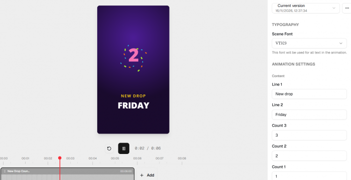
I checked the preview for text placement and whether the animation remained readable throughout the sequence. The exported dimensions were suitable for an Instagram Story, so no additional cropping was necessary.
This was the strongest output from my week with Swishy. Unlike the typography project, which needed a timing correction, the announcement was almost ready to publish.
My observation: Swishy was particularly effective at creating short, energetic social graphics. The final result required very little editing, and the vertical composition was preserved.
Creating Animated Charts
I also use charts and statistics in informational content, so I wanted to see whether Swishy could make data visually engaging without changing its meaning. I selected an animated bar chart with quarterly revenue growth.
Prompt I entered:
"Animated bar chart showing revenue climbing across Q1 to Q4, bars springing up one after another, clean labels, on-brand blue."
What the Output Looked Like
Swishy generated four bars that appeared sequentially with a spring-like rising effect. The movement was smooth, and the staggered timing made the chart easier to follow.
Visually, the animation looked polished. However, I noticed a problem with the numerical information. The generated values and labels needed correction before the chart could accurately represent the intended data.
I opened the editor and manually adjusted the figures and labels. The animation itself did not require major changes because the movement and overall composition were already suitable. This revealed an important difference between creating an attractive chart and creating an accurate data visualization.
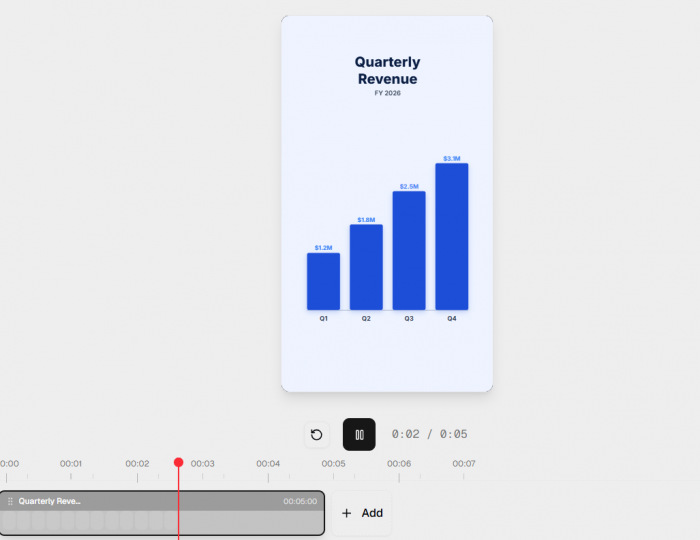
Swishy handled the visual movement well, but I still had to take responsibility for checking the numbers. For social media content that explains trends, the animation can make information easier to follow. However, exact figures should always be verified before publication.
My observation: The chart looked professional after editing, but numerical accuracy was the weakest part of this workflow. I would use Swishy to animate a chart, not to determine or validate its data.
Creating Logo and UI Animations
I explored two additional animation styles to understand how Swishy handled branded graphics and interface movement.
1. Logo Reveal
For the logo animation, I used a coffee brand concept called Fathom.
Prompt I entered:
“Minimal logo reveal for a coffee brand called 'Fathom', mark draws itself in, then the wordmark fades up underneath, warm cream background.”
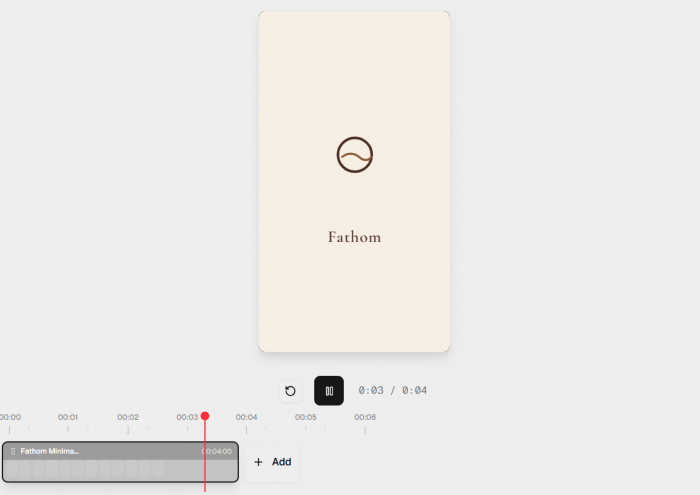
Swishy created a clean reveal with attractive movement. However, the initial design used a placeholder mark rather than my intended logo. After uploading the logo, I found that Swishy gave me less control over the exact order in which its elements appeared.
I revised the prompt a couple of times to improve the wordmark timing, but I could not define the draw-on path as precisely as I wanted. The final animation worked for a simple brand reveal. For more intricate logo movement, the editing controls felt restrictive.
2. Messaging Interface
Next, I created a short mobile messaging animation.
Prompt I entered:
"iPhone mockup with an iMessage conversation bubbling in, message says 'have a good day!', subtle notification pop at the top."
The generated interface looked convincing. Message bubbles appeared with a small scaling movement before settling into place, creating a familiar messaging-app effect. The notification also fitted the overall sequence. I made a minor adjustment to the bubble timing, but the rest of the design remained unchanged.
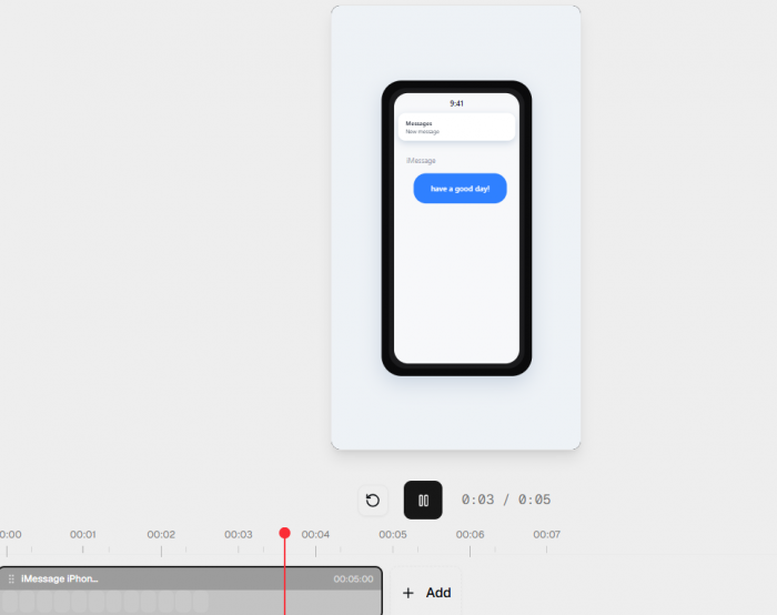
Compared with the logo reveal, this required much less work. These two outputs showed where Swishy's strengths and limitations differed. It handled familiar interface movements effectively, but precise branded animation needed more manual direction.
Editing and Refining Animations
The editing experience mattered more to me than the initial generation because social media graphics often need small changes before publication.
Swishy allowed me to modify supported elements within the generated scene instead of starting again every time. I worked with text, colors, backgrounds, durations, and animation timing across my projects.
For the typography animation, I adjusted the accent color and the delay before the final word. For the chart, I corrected numerical labels. For the messaging interface, I changed the timing of the message bubbles. These smaller changes were manageable.
Where Editing Became Difficult
I noticed more limitations when I tried creating a longer sequence.
Prompt I entered:
"A 5-scene launch video about a productivity app: hook, problem, product shot, three features, call to action, should flow and build energy."
Swishy generated a coherent sequence with the requested sections, but the transitions between scenes were less convincing than its individual animations. Some sections moved too quickly, while others needed stronger transitions to maintain the intended progression.
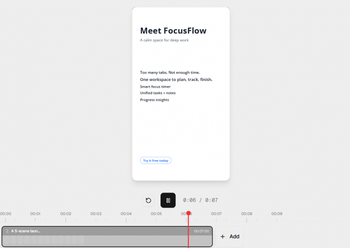
I had to revise the instructions several times and manually adjust scene durations. The final sequence was more usable after these changes, but it required considerably more attention than the single-scene graphics. I also noticed that repeating identical prompts did not always generate identical outputs.
My observation: Swishy worked best when I described the movement in a clear order. The more complex the sequence became, the more corrections were necessary. Its editing tools were useful, but they did not offer the detailed keyframe control of dedicated animation software.
Exporting My Animations
Once the animations were ready, I moved to exporting them for social media and video editing. During my use, I worked with formats including MP4, MOV, and GIF. I also explored transparent-background export options for animations intended to sit over existing footage.
| Format | How I used it |
| MP4 | Social media clips and animated graphics |
| MOV | Video editing workflows |
| GIF | Short looping animations and previews |
| Transparent export | Animated overlays for existing footage |
The exported files preserved the movement I had seen in the editor. I did not encounter a failed render or a noticeable difference between the preview and the completed exports.
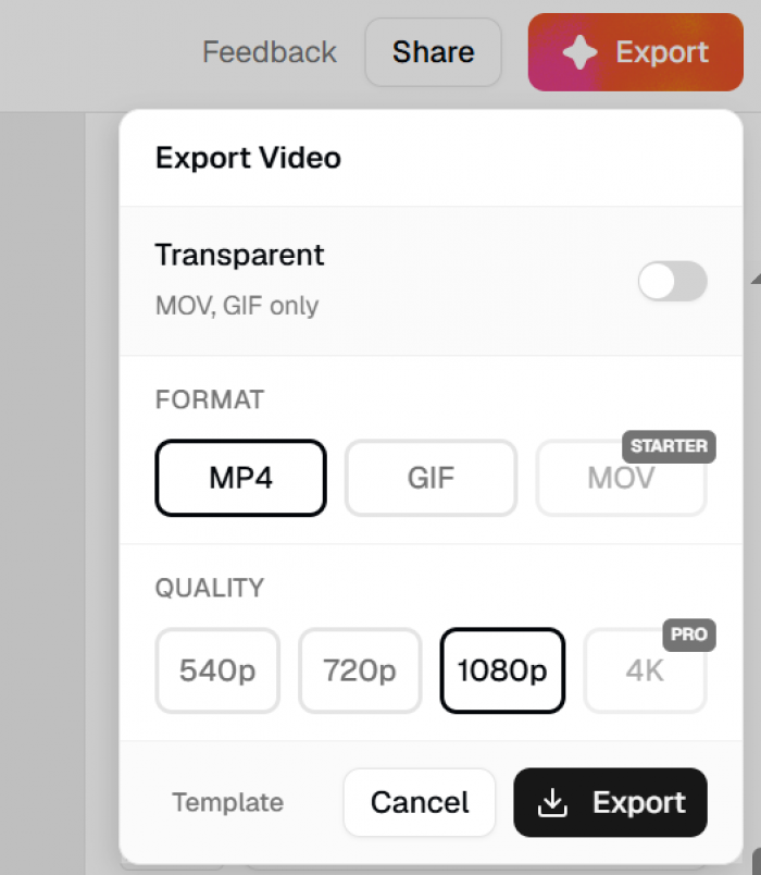
The Instagram Story output also retained its vertical framing, which meant I did not need to crop it in another application.
Transparent-background exports were particularly useful for overlay-style graphics. They allowed animated elements to be placed over other video content without manually removing a solid background. Overall, exporting was one of the smoother parts of my experience.
What Worked Best for Me
After working across several animation categories, I noticed a consistent pattern: Swishy delivered its strongest results when the animation focused on one clear idea.
The animated headline, Instagram Story, and messaging interface required relatively few adjustments. The chart and multi-scene project needed more attention because they involved accuracy or more complicated timing.
Three aspects stood out:
● Short animations looked polished. The movement generally had smooth easing, and the results did not resemble basic slide transitions.
● Templates provided useful starting points. Existing chart and interface designs reduced the amount of setup needed before making changes.
● Specific prompts improved consistency. Describing the order of movement produced better results than relying on broad instructions such as "make it dynamic."
Most straightforward generations took approximately 25–40 seconds during my use. Longer sequences took more time and occasionally required another attempt.
I did not experience browser crashes or failed renders. The main interruption was an occasional pause while a new preview loaded. The most useful lesson was that Swishy responded better to explicit animation instructions than to creative descriptions alone.
Limitations I Noticed
Swishy made short motion graphics easier to create, but several limitations became clear during more detailed work.
● Limited animation precision: I could adjust supported elements and timing, but I could not control movement with the same precision available in a traditional keyframe editor. This was particularly noticeable during the logo reveal.
● More work for complex sequences: The five-scene productivity video required several prompt revisions and duration adjustments. Swishy understood the broad structure, but its transitions needed improvement.
● Manual data corrections: The chart animation looked attractive, yet I still had to correct values and labels. Numerical accuracy could not be left unchecked.
● Inconsistent regeneration: Reusing a prompt did not always produce the same result. This made it harder to reproduce an exact animation after making broader changes.
● Credit consumption: Multiple revisions can increase usage, particularly when a project requires several generations. This matters more for longer or highly specific animations than for simple text effects.
These issues did not prevent me from producing usable graphics. They mainly affected how much time I spent refining the results after generation.
Swishy AI Pricing and Value
Swishy AI offers two paid plans, Beginner and Pro, alongside its limited free access. The platform uses AI credits for generation, so the cost depends on how frequently animations are created and revised.
The pricing screen offers monthly and yearly billing. I checked the yearly option, which displayed the following prices:

The Beginner plan includes access to the Mini, Starter, and Best AI models. It is a more practical starting point for creators producing animated headlines, social media announcements, and short motion graphics regularly.
The Pro plan includes all models, including Pro, and provides 400 monthly AI credits. It offers more generation capacity for users creating animations frequently or working on multiple projects.
Is Swishy AI Worth the Price?
During my use, short animations needed fewer adjustments than complicated multi-scene projects. The animated Instagram Story was almost ready after its first generation, while the five-scene productivity video required several prompt revisions and timing changes.
That difference matters when working with a credit-based tool. A plan offering 150 credits does not necessarily mean 150 finished animations, particularly when additional generations are needed to correct an output.
For my social media workflow, the Beginner plan looks sufficient for regular short graphics. The Pro plan makes more sense for higher-volume production and access to the more advanced AI models. The displayed prices apply to annual billing. Monthly-billing prices were not visible in the screenshot, so they should be checked separately before subscribing.
Who Should Use Swishy AI?
Swishy is most useful for creators and marketers who need motion graphics without building every animation manually.
| User | My assessment |
| Social media creators | Strong fit for announcements and animated titles |
| Content marketers | Useful for short promotions and branded graphics |
| Educators | Good for animated explanations, with data checks |
| SaaS marketers | Useful for interface and notification animations |
| Professional animators | Better for quick concepts than precision work |
I would keep using it for Instagram Stories, animated headlines, short explainer graphics, and overlays. For detailed logo animation, complex transitions, or projects requiring exact movement control, I would still prefer a dedicated motion design application.
The choice depends on the finished output required. Swishy is particularly effective when speed and visual presentation matter more than frame-level customization.
Final Verdict: Would I Keep Using Swishy AI?
Yes. Swishy earned a place in my social media content workflow because the shorter animations were genuinely useful. The Instagram Story needed almost no correction, the typography animation was ready after small timing changes, and the messaging interface looked convincing.
The experience was less consistent with detailed logo animation, charts requiring exact values, and longer multi-scene content. These projects needed more editing, but they also made Swishy's practical limits easier to understand.
My Swishy AI Ratings
| Category | Rating |
| Ease of use | 4.6/5 |
| Output quality | 4.1/5 |
| Generation speed | 4.4/5 |
| Editing control | 3.1/5 |
| Value for money | 4.0/5 |
Overall rating: 4.1/5
Swishy is a good addition to a social media production workflow, particularly for short, visually polished animations. I would continue using it for titles, announcements, and overlays, while keeping conventional editing tools for projects that require greater precision.