


Table of Content
- What Makes Bios Stylish?
- Popular Instagram Font Styles
- Cute and Aesthetic Bios
- Attitude and Confident Bios
- Short, Meaningful Bio Ideas
- Stylish Bio Font Generators
- Choose Your Font Wisely
- Add Symbols Without Clutter
- Copy Fonts Into Instagram
- Mistakes That Ruin Bios
- Create a Signature Bio
- Verdict: Keep It Personal
A stylish Instagram bio can say a lot about someone's personality before they even post a picture. Sometimes, the difference is as simple as changing ordinary text into elegant cursive, adding a tiny flower symbol, or choosing a sentence that feels genuinely personal.
But stylish fonts aren't always easy to read, and decorating every word rarely produces the best result. The trick is finding lettering that looks attractive while keeping the bio meaningful. Here are font styles, original bio ideas, and practical tools to help create a profile that feels more personal.
What Makes Bios Stylish?
A stylish Instagram bio combines typography, wording, spacing, and small visual details. Changing the font alone can make a familiar sentence look different, but the actual words still determine what visitors learn about the person behind the profile.
Consider this simple example:
Ordinary bio: Creating my own sunshine.
Stylish bio: ✿ 𝒞𝓇𝑒𝒶𝓉𝒾𝓃𝑔 𝓂𝓎 𝑜𝓌𝓃 𝓈𝓊𝓃𝓈𝒽𝒾𝓃𝑒 ✿
Both communicate the same message, but the second has a softer, decorative appearance. The cursive lettering and matching flower symbols create an aesthetic without requiring additional words.
However, style should support the message rather than compete with it. An Instagram bio has a 150-character limit, so every phrase, emoji, and decorative element uses valuable space. For personal accounts, a short expressive line may be enough. For creators or professionals, identity and interests often deserve more space than decoration.
Popular Instagram Font Styles
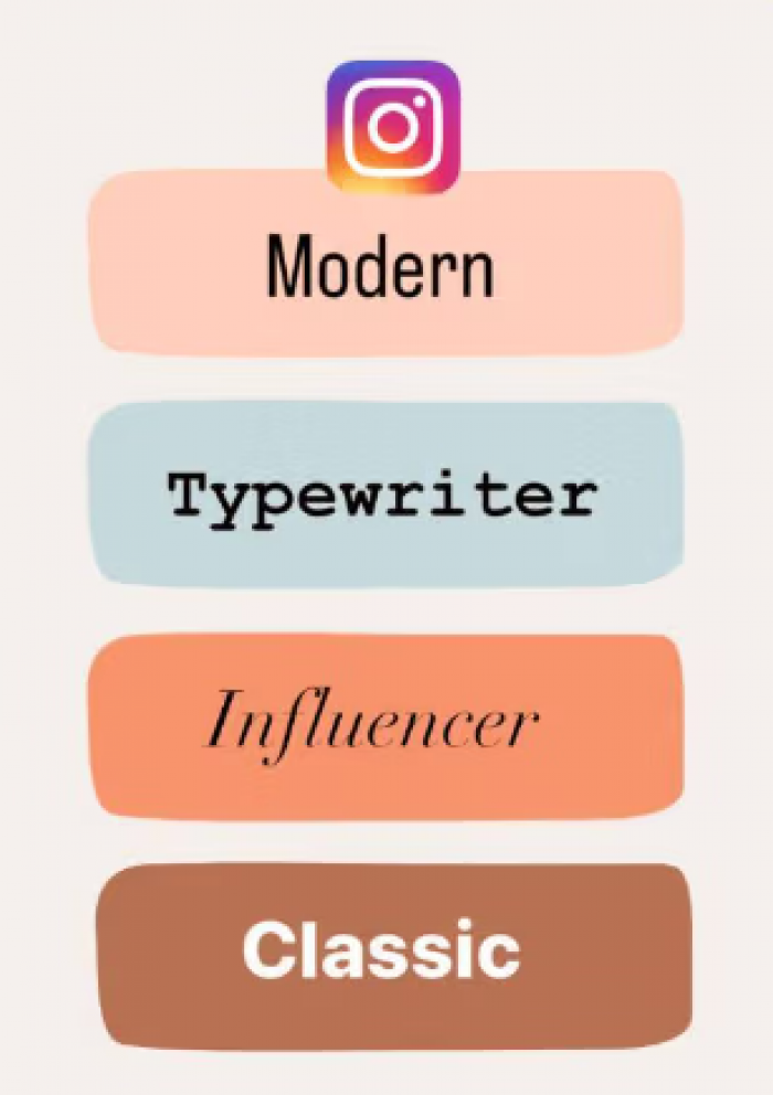
Instagram doesn't provide a built-in font selector for profile bios. Instead, online generators replace ordinary letters with visually similar Unicode characters. These symbols can be copied into Instagram, although their appearance and readability can vary between devices.
Different styles communicate different personalities, even when the wording stays identical.
| Font style | Example | Suitable aesthetic |
| Cursive | 𝒟𝓇𝑒𝒶𝓂 𝒷𝒾𝑔 | Elegant and romantic |
| Bold | 𝗗𝗿𝗲𝗮𝗺 𝗯𝗶𝗴 | Confident and modern |
| Gothic | 𝕯𝖗𝖊𝖆𝖒 𝖇𝖎𝖌 | Dark and dramatic |
| Small caps | ᴅʀᴇᴀᴍ ʙɪɢ | Clean and understated |
| Monospace | 𝙳𝚛𝚎𝚊𝚖 𝚋𝚒𝚐 | Creative and minimalist |
| Bubble | Ⓓⓡⓔⓐⓜ ⓑⓘⓖ | Cute and playful |
Cursive fonts often work well for romantic or soft aesthetic bios, while bold lettering gives short statements more presence. Small caps and monospace characters suit profiles that prefer tidy spacing and fewer decorations.
Gothic and bubble styles are more distinctive, but using them across several sentences can make the bio tiring to read. A useful approach is to style one phrase and keep the supporting information in ordinary text.
Cute and Aesthetic Bios
Cute Instagram bios don't need to rely on repeated references to butterflies, princesses, or fairy tales. The strongest aesthetic bios usually have a recognizable mood: gentle, imaginative, cheerful, or quietly personal.
Soft-girl aesthetic
- ✿ 𝓈𝑜𝒻𝓉 𝒽𝑒𝒶𝓇𝓉, 𝓌𝒾𝓁𝒹 𝒾𝒹𝑒𝒶𝓈 ✿
- ♡ 𝓅𝑒𝓉𝒶𝓁𝓈 & 𝓅𝑜𝓈𝓈𝒾𝒷𝒾𝓁𝒾𝓉𝒾𝑒𝓈 ♡
- ☁ collecting little moments
- ୨୧ 𝓂𝒶𝒹𝑒 𝑜𝒻 𝓈𝑜𝒻𝓉 𝓈𝓊𝓃𝒹𝒶𝓎𝓈
Dreamy and romantic
- ☾ somewhere between dreams & daylight
- ✧ 𝒻𝒾𝓃𝒹𝒾𝓃𝑔 𝒷𝑒𝒶𝓊𝓉𝓎 𝒾𝓃 𝓉𝒽𝑒 𝑜𝓇𝒹𝒾𝓃𝒶𝓇𝓎
- ♡ love letters to ordinary days
- ⋆。°✩ a little lost in lovely things
Minimalist aesthetic
- ᴍᴏʀᴇ ʟɪꜰᴇ, ʟᴇꜱꜱ ɴᴏɪꜱᴇ
- ✧ growing at my own pace
- 𝚜𝚒𝚖𝚙𝚕𝚎 𝚍𝚊𝚢𝚜, 𝚍𝚎𝚎𝚙 𝚝𝚑𝚘𝚞𝚐𝚑𝚝𝚜
- becoming, without rushing ♡
These examples are deliberately short because lengthy decorative sentences often lose their charm in the narrow profile layout. A girl who enjoys photography, books, fashion, or travel can make any of these more personal by replacing a generic phrase with a real interest.
For instance, "collecting little moments" could become "collecting café sketches & little moments." That small change tells visitors something specific rather than simply suggesting an aesthetic.
Attitude and Confident Bios
Confident bios are often associated with crowns, dramatic quotes, and statements about ignoring everyone else. That approach can work for a playful profile, but confidence can also come through humor, independence, and a clear sense of personal direction.
Consider these styles:
Bold and independent
- 𝐌𝐚𝐤𝐢𝐧𝐠 𝐫𝐨𝐨𝐦 𝐟𝐨𝐫 𝐦𝐲𝐬𝐞𝐥𝐟 ✦
- 𝙼𝚢 𝚙𝚊𝚌𝚎. 𝙼𝚢 𝚙𝚊𝚝𝚑.
- ✧ quietly building something beautiful
- 𝗜 𝗽𝗿𝗲𝗳𝗲𝗿 𝗺𝘆 𝗼𝘄𝗻 𝗱𝗶𝗿𝗲𝗰𝘁𝗶𝗼𝗻
Classy and understated
- Elegance without an announcement.
- 𝒜 𝓁𝒾𝓉𝓉𝓁𝑒 𝑔𝓇𝒶𝒸𝑒, 𝒶 𝓁𝑜𝓉 𝑜𝒻 𝒶𝓂𝒷𝒾𝓉𝒾𝑜𝓃
- ♡ private life, colorful mind
- 𝙲𝚘𝚗𝚏𝚒𝚍𝚎𝚗𝚝, 𝚗𝚘𝚝 𝚗𝚘𝚒𝚜𝚢.
The distinction is useful when choosing fonts. Bold lettering works for direct statements, while elegant cursive can soften a confident message. Pairing an already dramatic sentence with heavy gothic lettering and several crown symbols may create more visual noise than personality.
A strong attitude bio doesn't need to explain how powerful someone is. It can express independence through the choices, interests, and boundaries reflected in the wording.
Short, Meaningful Bio Ideas
A meaningful bio doesn't have to be philosophical. It can reveal a personal value, a hobby, a current ambition, or the kind of moments someone enjoys sharing. Short bios are particularly suitable for accounts where the photographs already communicate much of the personality.
Here are a few ideas for different interests:
- For students: ✧ learning beyond the classroom
- For photographers: 𝚌𝚘𝚕𝚕𝚎𝚌𝚝𝚒𝚗𝚐 𝚕𝚒𝚐𝚑𝚝 & 𝚕𝚒𝚝𝚝𝚕𝚎 𝚜𝚝𝚘𝚛𝚒𝚎𝚜
- For book lovers: ☾ living several stories at once
- For artists: 𝒸𝓇𝑒𝒶𝓉𝒾𝓃𝑔 𝓌𝒽𝒶𝓉 𝓌𝑜𝓇𝒹𝓈 𝒸𝒶𝓃'𝓉 𝑒𝓍𝓅𝓁𝒶𝒾𝓃
- For travelers: ✈ places change, curiosity stays
- For lifestyle creators: 𝗦𝘁𝘆𝗹𝗲, 𝘀𝘁𝗼𝗿𝗶𝗲𝘀 & 𝘀𝗺𝗮𝗹𝗹 𝗷𝗼𝘆𝘀
An effective bio often combines an interest with an attitude toward life. "Travel lover" identifies a hobby, but "places change, curiosity stays" communicates both an interest and a perspective.
For a public creator account, clarity may be more useful than a poetic statement alone. Someone sharing fashion content could write "Personal style | Thrift finds | Everyday outfits" and use a decorative font only for a short opening phrase.
Stylish Bio Font Generators
Writing an original bio is only half the process. Choosing the right lettering can take longer, particularly when generators display dozens of nearly identical variations.
The following five tools offer different ways to experiment with Unicode text. They are best understood as copy-and-paste styling utilities rather than font installation software.
1. YayText: Familiar Font Styles
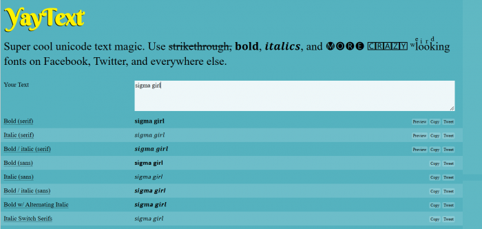
YayText is useful for exploring established text styles such as bold, italic, cursive, small caps, bubble letters, gothic, and monospace. After entering a phrase, users can compare variations and copy the preferred result.
Its main advantage is the selection of recognizable lettering styles. Instead of focusing entirely on decorative frames, YayText also provides relatively restrained options suitable for highlighting a short phrase.
Styling example: 𝒮𝓂𝒶𝓁𝓁 𝓉𝒽𝒾𝓃𝑔𝓈, 𝒷𝒾𝑔 𝒻𝑒𝑒𝓁𝒾𝓃𝑔𝓈
What stands out: Separate style categories make it convenient to compare traditional bold, script, and unusual character combinations.
Where it falls short: Some experimental styles are difficult to read and contribute little to an otherwise simple Instagram bio.
Best suited for: Minimalist, elegant, and readable-looking bio designs.
2. SmartPostly: Aesthetic Font Variety
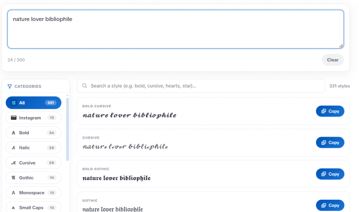
SmartPostly's Fancy Text Generator offers more than 300 styling variations, including cursive, bold, gothic, small caps, hearts, flowers, stars, and decorative frames.
The generator displays variations as text is entered, with category filters and a search field to narrow the options. Each result has a copy control, so users can explore different visual directions without repeatedly entering the same phrase.
For someone creating a soft-girl bio, the flowers and cursive categories provide an obvious starting point. A more confident aesthetic may suit bold or gothic lettering, while the small caps category offers a quieter appearance.
Styling example: ✧ 𝓁𝒾𝓉𝓉𝓁𝑒 𝒹𝓇𝑒𝒶𝓂𝓈, 𝒷𝒾𝑔 𝒾𝒹𝑒𝒶𝓈 ✧
What stands out: The combination of real-time previews, category filters, and decorative styles helps narrow a large collection to a particular aesthetic.
Where it falls short: A collection this large includes many similar-looking results. Highly decorated options can also make short bios unnecessarily complicated.
Best suited for: Girls experimenting with cute, romantic, bold, or highly decorative Instagram bios.
3. IGFonts.io: Instagram-Focused Lettering
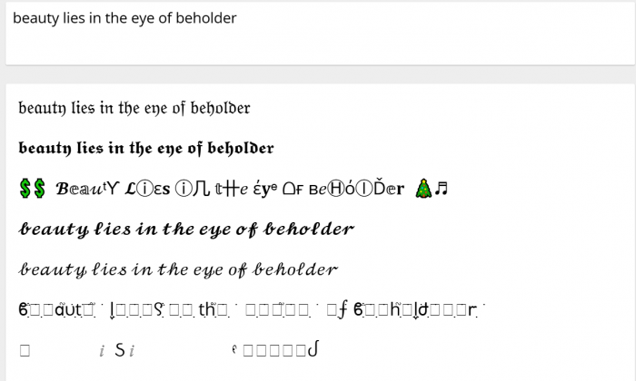
IGFonts.io takes a straightforward approach to Instagram typography. Users enter text and receive multiple stylized versions designed for copying into bios, captions, and other text fields.
Its interface centers on the converted text rather than requiring users to understand typography categories. The option to generate additional variations is useful when the initial results don't fit the intended mood.
Styling example: 𝓉𝒾𝓃𝓎 𝒹𝑒𝓉𝒶𝒾𝓁𝓈, 𝒷𝒾𝑔 𝓂𝑒𝓂𝑜𝓇𝒾𝑒𝓈
What stands out: Its Instagram-focused interface keeps the process simple for someone who only wants to update a profile.
Where it falls short: Browsing more results doesn't automatically make choosing easier. Many variations differ only slightly in decoration or character shape.
Best suited for: Quick Instagram profile changes without extensive font customization.
4. LingoJam: Playful Text Effects
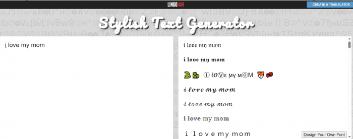
LingoJam's Stylish Text Generator converts ordinary text into alternative Unicode arrangements through a simple text-conversion interface.
It appeals to users who prefer experimenting with unusual lettering rather than choosing only familiar cursive or bold styles. This makes it interesting for personal accounts where playful expression matters more than maintaining a polished professional identity.
Styling example: 𝙼𝚊𝚔𝚒𝚗𝚐 𝚖𝚢 𝚘𝚠𝚗 𝚔𝚒𝚗𝚍 𝚘𝚏 𝚖𝚊𝚐𝚒𝚌
What stands out: Its conversion-focused design makes comparing different treatments of the same sentence straightforward.
Where it falls short: Some outputs rely on unfamiliar Unicode characters that may display inconsistently or become awkward to read.
Best suited for: Quirky, expressive, and playful personal bios.
5. FancyText.io: Organized Font Browsing
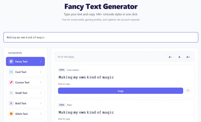
FancyText.io provides a collection of Unicode lettering styles, including bold, cursive, small text, decorative symbols, and other variations.
Its category-oriented presentation is useful when users already know what kind of lettering they want. Someone looking for elegant script can concentrate on cursive styles instead of working through every decorative alternative.
Styling example: 𝗟𝗶𝘃𝗶𝗻𝗴 𝗳𝗼𝗿 𝘁𝗵𝗲 𝗹𝗶𝘁𝘁𝗹𝗲 𝘁𝗵𝗶𝗻𝗴𝘀 ♡
What stands out: Organized style browsing and straightforward copying make it practical for comparing several font families.
Where it falls short: Like other Unicode generators, it cannot guarantee that every decorative character will render or be announced correctly across devices.
Best suited for: Users who prefer browsing font categories before selecting a style.
Font Generator Comparison
| Tool | Main strength | Best bio aesthetic |
| YayText | Familiar typography styles | Minimal and elegant |
| SmartPostly | Large, filterable style library | Cute and decorative |
| IGFonts.io | Instagram-focused workflow | Quick profile changes |
| LingoJam | Experimental text variations | Playful and expressive |
| FancyText.io | Category-based font browsing | Curated and stylish |
All five tools produce text that users can copy into compatible fields. The more important difference is how easily each helps someone find an attractive, readable result.
Choose Your Font Wisely
Font selection should start with the personality of the account, not the number of available styles. A profile built around personal photography may need quiet, elegant lettering, while a fashion creator might prefer a bold phrase that complements colorful content.
A few practical choices help maintain that balance:
● Match lettering to the message. Cursive suits gentle or romantic wording, while bold text emphasizes confidence. Combining an aggressive statement with overly delicate lettering can produce a confusing impression.
● Limit decorative fonts to selected phrases. Keep practical details such as interests, locations, professional roles, and contact information readable, particularly on creator or business profiles.
● Check how the text looks on different devices. Certain Unicode characters may display as blank squares or unfamiliar symbols when a device lacks suitable font support.
● Keep important names searchable. Decorative characters are technically different from ordinary Latin letters, so using them in a profile's Name field may interfere with exact-name matching and discoverability.
Accessibility matters as well. Some screen readers pronounce fancy Unicode characters individually or announce their technical character names rather than reading them like an ordinary sentence. Using plain text for essential information is usually the safer choice.
Add Symbols Without Clutter
Symbols help establish visual rhythm, especially in short Instagram bios. A flower can soften a romantic phrase, a star can highlight an aspiration, and a small dot can separate interests without creating another line.
However, decoration works best when each element has a purpose.
| Decoration level | Example | Impression |
| None | Finding beauty in ordinary days | Simple and direct |
| Light | ✧ Finding beauty in ordinary days | Balanced and attractive |
| Excessive | ꧁♡✿✨Finding✨beauty✿♡꧂ | Busy and distracting |
A useful rule is to choose one decorative family, such as flowers, stars, or hearts, and use it consistently. Mixing crowns, butterflies, arrows, fire, and several unusual brackets usually creates competing visual elements.
Spacing also matters. A two-line bio with one symbol at the start of each line often appears more intentional than a single long sentence surrounded by decorations.
Copy Fonts Into Instagram
Adding a stylish font to an Instagram bio is relatively simple, but checking the finished result is important. Decorative text that appears perfect inside a generator may wrap differently once placed into the profile.
Follow these steps:
1. Write the bio in ordinary text first. Decide what it should communicate before choosing decorative lettering, and keep the message comfortably within Instagram's 150-character limit.
2. Open a stylish font generator. Enter the completed phrase and compare cursive, bold, minimalist, or decorative variations.
3. Copy the preferred style. Choose an option that preserves recognizable letters rather than automatically selecting the most unusual-looking result.
4. Edit the Instagram profile. Open Instagram, visit the profile, select Edit Profile, and paste the copied text into the Bio field.
5. Review the published appearance. Check line breaks, symbols, readability, and character rendering. If possible, view it on another device before settling on the final version.
Some mathematical Unicode letters are represented by multiple underlying code units, while certain decorations contain combining marks. As a result, a phrase that looks short may consume more of a text field's character allowance than expected.
If Instagram rejects an otherwise short-looking bio, reduce the decorative lettering, remove unnecessary marks, and try a simpler version.
Mistakes That Ruin Bios
Some bios become difficult to understand because their visual styling receives more attention than their content. A decorative font can help distinguish a profile, but it cannot compensate for vague wording or confusing formatting.
The most common problems include:
● Using several font families together: Switching between cursive, gothic, bubble, and bold letters within one sentence makes the profile look inconsistent and slows reading.
● Copying personality-free quotes: Familiar statements about being different or living like a queen reveal little about someone's actual interests, humor, or experiences.
● Styling essential profile information: Converting a person's name, profession, or important keywords into decorative Unicode can affect accessibility and make the information harder to search.
● Overloading the bio with symbols: Repeating hearts, stars, and ornamental frames uses character space while making the central message less visible.
● Ignoring the rest of the profile: A dramatic luxury-themed bio may feel disconnected from an account focused on everyday photography, studying, or quiet personal moments.
The solution isn't to abandon stylish fonts. It is to decide which part of the bio deserves emphasis and keep the remaining information clear.
Create a Signature Bio
A memorable Instagram bio usually begins with a specific personal detail. Instead of choosing a font and then searching for a sentence to decorate, understanding how to write an Instagram bio helps identify something the profile genuinely represents.
A simple structure works for many personal accounts:
Personal interest + distinctive perspective + light styling
For example, someone interested in photography and quiet travel could write:
✧ 𝒞𝑜𝓁𝓁𝑒𝒸𝓉𝒾𝓃𝑔 𝓁𝒾𝓉𝓉𝓁𝑒 𝓈𝓉𝑜𝓇𝒾𝑒𝓈
film photos & unfamiliar streets
The first line provides personality, while the second gives the visitor concrete information. The combination feels more individual than a heavily decorated inspirational quote.
For a student who shares everyday experiences, something simpler might work:
♡ 𝚜𝚝𝚒𝚕𝚕 𝚏𝚒𝚐𝚞𝚛𝚒𝚗𝚐 𝚒𝚝 𝚘𝚞𝚝
books, coffee & campus days
Neither bio requires complicated symbolism. The styling creates an impression, while the words provide context.
Verdict: Keep It Personal
The best stylish Instagram bio for girls isn't necessarily the one with the fanciest lettering. It is the one that looks attractive, remains readable, and reflects something recognizable about the person behind the account.
Cursive, bold, gothic, and decorative Unicode styles all have their place, and generators such as YayText, SmartPostly, IGFonts.io, LingoJam, and FancyText.io make experimenting with them straightforward.
Start with a phrase that feels personal, choose a font that complements its meaning, and use symbols sparingly. A bio with a clear identity and thoughtful styling will usually make a stronger impression than one built entirely around decoration.