


Table of Content
- Know What You Are First
- The Two Images Everyone Sees
- Your Name, Handle and Link
- An About Section With a Pulse
- Build a Small Brand System
- Buttons and Info That Work
- Make the Feed Earn Its Keep
- How You Reply Is on Display
- Proof You're the Real Thing
- Small Fixes, Big Difference
- Keep It From Going Stale
- The Verdict
A customer lands on your Facebook page and makes up their mind about you in roughly the time it takes to read a sentence. They are not studying your mission statement. They are reacting to a blurry logo, an empty About box, or a last post from fourteen months ago, and deciding whether you are a real operation worth their money.
"Professional" is not a coat of paint you add at the end. It is the sum of small signals that tell a stranger you are competent, present, and safe to buy from. This guide walks through each of those signals, in the order they matter, so your page reads as a business rather than a hobby.
Know What You Are First
Logos and colours come later. A page looks amateur not because the design is ugly, but because it cannot answer a simple question: who is this for, and what does it do?
Before you touch a single image, write one plain sentence that finishes "This page exists to help ___ do ___." A bakery's answer is different from a B2B consultant's, and that difference should steer the photos you post, the tone of your captions, and even which contact button you choose. Once the identity is settled, every other decision gets easier, because each element now has a job: point back to that one sentence.
The real test : Show your page to someone who has never heard of your business. If they cannot tell what you sell and who you serve within ten seconds, no amount of polish will fix it. Clarity is the first layer of professionalism.
The Two Images Everyone Sees
Your profile picture and cover photo are the only design elements every visitor is guaranteed to see. They are also the two things people most often get wrong, usually by uploading at the wrong size and letting Facebook crop the result badly.
The profile picture is your anchor. It sits next to every post and comment you make, shrunk to a small circle, so it has to stay recognisable at tiny sizes. For most businesses that means a clean logo mark or a sharp, well-lit headshot, not a busy group photo. The cover photo is your billboard: wide, prominent, and the right place for a current offer, your tagline, or a shot of the work you actually do.
| Image | Upload at | Shape & notes |
| Profile picture | Up to 2048 × 2048 px (320 × 320 minimum) | Displays as a circle. Keep the subject centred and simple so it survives when small. |
| Cover photo | Around 820 × 360 px for the safe area; a larger file stays crisp | Shows at 820 × 312 on desktop and 640 × 360 on mobile, so the edges trim differently on each. |
The trap is the crop. Because desktop and mobile show different slices of the cover, any text or logo pushed to the edges gets cut off on one of them. Keep the important content toward the centre, leave breathing room around it, save it in sRGB colour, and check it on your phone before you walk away.
Your Name, Handle and Link
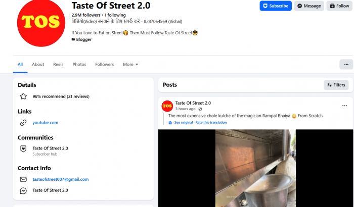
A sloppy name is a quiet credibility killer. A page stuffed with keywords, like "Joe's Plumbing Best Cheap Emergency Plumber Near You," reads as spam before anyone sees the work. Use the name people would actually say out loud, the one that matches your signage, invoices, and website.
Then claim a clean username, the @handle that becomes your page's short link. Keep it short, keep it matching your Instagram and website wherever you can, and avoid numbers or underscores that are hard to say aloud. One recognisable handle across platforms signals an organised business; three mismatched ones signal a scramble.
An About Section With a Pulse
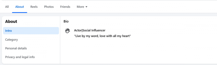
The About section is where curiosity gets confirmed or killed. Blank hours, a missing website, or a one-line description tell visitors you do not tend to your own storefront. Completeness alone, oddly, reads as professional: a fully filled page simply looks like it is run by someone who cares.
So fill every field, but fill it like a brand rather than a tax form. The short description should say what you do and for whom in a human voice. A clear Facebook About section can establish that context quickly, while the longer story gives you room to explain why you exist and what sets you apart without the stiff corporate throat-clearing.
● Lead with the customer, not your founding date. People care what you can do for them far more than the year you opened; weave the history in later if it builds trust.
● Make contact details frictionless and current. A phone number that rings, an email someone checks, and an address that matches Google Maps all quietly reassure a cautious buyer.
● Pick the most accurate category. The category you choose decides which features and fields Facebook offers you, so a vague one leaves useful tools switched off.
Build a Small Brand System
You do not need a design degree. You need a handful of decisions made once and then repeated: two or three colours, one or two fonts, and a consistent way your logo appears. That repetition is what separates a page that looks designed from one that looks assembled out of whatever was lying around.
The shortcut is a simple template. Build one or two reusable post layouts in a free tool like Canva, with your colours and fonts already baked in, and reach for them every time you post. Within a few weeks the feed starts to look like a single, deliberate brand instead of a scrapbook, and that coherence gets read instantly as competence.
Buttons and Info That Work
A professional page is also a working one. Facebook lets you place action buttons near the top of your page, usually up to two, so pick the ones that match how you actually win business rather than defaulting to whatever sits first on the list.
| If your goal is… | A sensible button |
| Starting conversations | Message or Send WhatsApp message |
| Phone-driven service work | Call now |
| Appointments and bookings | Book now |
| Direct selling | Shop now |
| Leads or email signups | Sign up or Contact us |
Around the button, finish the practical scaffolding: accurate opening hours, a location if you have one, a services or shop tab where relevant, and a pinned post at the top of your feed. The pinned post is underused and valuable, because it lets you control the first thing visitors read, whether that is your best offer, a short welcome, or proof of recent work.
Make the Feed Earn Its Keep
Anyone deciding whether to trust you will scroll, and what they find there matters more than any banner. A feed of grainy photos, erratic gaps, and copy-pasted motivational quotes undoes everything the header promised.
Quality beats quantity, and consistency beats both. A page that posts one genuinely useful thing a week, every week, looks far more professional than one that dumps ten posts in a day and then vanishes for two months. The steady rhythm is itself a signal that someone is home and paying attention.
● Treat the first few posts as a shop window. New visitors see the top of your feed first, so make sure your strongest, clearest work sits where they land.
● Write captions like a person, not a brochure. A short, specific caption with a point of view reads as real, and useful caption templates can provide structure without making every post sound the same; recycled hashtag soup reads as filler.
● Shoot in good light. You do not need a studio, but a bright, in-focus phone photo beats a dark, cluttered one every time, and photo quality is the thing viewers judge fastest.
How You Reply Is on Display
Responsiveness is one of the few professionalism signals Facebook shows the public directly. A page that replies to the bulk of its messages quickly can earn a visible "very responsive to messages" badge, which takes keeping a high response rate and a fast median reply time over a rolling seven-day window. A visitor reads that badge as a simple promise: these people pick up the phone.
You do not have to be instant to look professional, you have to be honest. If you cannot reply within minutes, set an expectation instead. Facebook lets you control the response time shown publicly and switch on an away message, so someone messaging at midnight knows to expect an answer in the morning rather than wondering whether anyone is there at all.
Often overlooked : How you handle a bad review is more visible than the review itself. A calm, specific, non-defensive reply to a complaint quietly tells every future reader that you are a grown-up operation, and it usually does more good than the one star does harm.
Proof You're the Real Thing
Design earns attention; proof earns money. Strangers trust other strangers, so the credibility built by reviews, recommendations, and visible real-world activity outweighs almost anything you say about yourself.
Make it easy and make it visible. Ask happy customers to leave a recommendation while the good experience is still fresh. Share photos of real jobs, real events, and real people using what you make. Where it is available to you, verification plus a tidy, complete profile all add up to a page that signals permanence rather than a fly-by-night setup.
Small Fixes, Big Difference
Beyond the big pieces sits a set of tiny fixes that cost minutes and separate a careful page from a careless one. Individually they are trivial. Together they are the difference between "runs a tight ship" and "has not logged in since the launch."
● Purge outdated information. A holiday promo still pinned in spring, or hours that are no longer true, make everything else look unmanaged.
● Check every link. One dead link to your website is a small thing that reads as a big red flag to a cautious buyer.
● Keep emoji and hashtags disciplined. A couple, used on purpose, look modern; a wall of them looks desperate.
● Run the page from Meta Business Suite. Handling posts, messages, and insights from one proper dashboard is how you keep all of the above consistent without it becoming a chore.
Keep It From Going Stale
Professionalism decays if you let it. A page that looked sharp at launch slowly rots as offers expire, hours change, and Facebook quietly rearranges its own features. The polish is a habit, not a one-time setup.
The fix is a short, scheduled review rather than a heroic overhaul. Put a recurring reminder in your calendar and run the same quick pass each time.
| How often | What to check |
| Monthly | Pinned post still relevant, hours correct, links working, recent activity visible. |
| Quarterly | Cover photo and offers refreshed, About details current, unanswered messages cleared. |
| As it happens | New Facebook features or layout changes, so nothing core broke in an update. |
The Verdict
Notice how little of this was about graphic design. A professional Facebook page is built from clarity, completeness, consistency, and attention kept up over time, with good imagery sitting on top rather than carrying the weight alone.
Each signal is small: a sharp profile picture, a filled-out About box, a quick reply, a working link. But they stack, and a visitor feels the sum long before they can name any single part. That accumulated impression is exactly what turns a casual scroller into someone willing to message, book, or buy.
Start with one thing today: open your page as a stranger would, on your phone, and fix the first thing that makes you wince. Do that once a week, and within a month you will have a page that looks like it is run by a business worth trusting, because it is.