

Table of Content
- Your bio is a doorway, not a diary
- The name field everyone wastes
- A first line that says nothing
- Describing yourself instead of the visitor
- Emoji clutter and the decoration trap
- The vanity line: flexing without context
- The dead or lazy link
- The missing call-to-action
- Highlights that undermine the bio
- Trying to be everything to everyone
- When the bio and the grid disagree
- The mistakes at a glance
- The verdict: read it like a stranger will
Someone lands on your profile from a reel, a tag, or a search. They give it about three seconds before deciding whether to tap, follow or swipe away. In that window they don't really read your bio, they glance at it. And a surprising number of profiles lose the following right there, not because the content is bad, but because the bio quietly tells people there's no reason to stay. These are the mistakes that cause that, and what to do instead.
Your bio is a doorway, not a diary
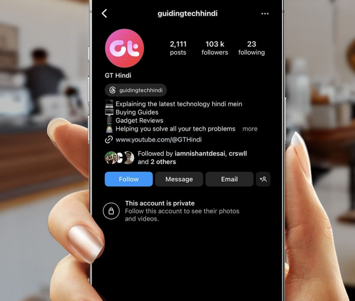
Most bios fail for one reason: they're written as a description of the person instead of a reason for a stranger to care. "Dog mum. Coffee lover. Living my best life." is a diary entry. It tells a visitor who you are, but not what they get by following you.
The shift that fixes almost everything is small but ruthless. Stop answering "who am I?" and start answering the one question a stranger is silently asking: "what's in this for me?" A doorway points somewhere. A diary just sits there.
Hold that lens over every mistake below. Most of them are really the same mistake in a different outfit, a bio that serves the owner instead of the visitor, so it helps to know what each part of the profile is actually for:
| The field | What it's really for |
| Name (bold line) | Search: the keyword people type to find someone like you |
| @handle | Your address, so keep it simple and spellable |
| First bio line | The one line guaranteed to be read, so place the visitor instantly |
| Rest of the bio | The payoff first, then the proof |
| Link | The one tap off your profile into your actual business |
| Highlights | A second chance to answer "what's in it for me?" |
The name field everyone wastes
Instagram gives you two name slots, and most people only use one of them well. There's the @handle (your username) and the Name field, the bold line under your photo. That bold Name field is searchable. Your bio text is not.
The common mistake is filling the Name field with your actual name when nobody is searching for it. "Sarah Jennings" in bold does nothing for a stranger looking for a Dubai food blogger or a prenatal yoga coach. You've handed Instagram's search a blank.
The fix is to pair your name with the thing people actually type. "Sarah | Dubai Food" or "Sarah Jennings, Prenatal Yoga" makes you findable and tells a visitor what you're about in the same breath.
The fix: put a searchable keyword in the Name field, not just your name. It's the one field Instagram search actually reads.
A first line that says nothing
The first line of your Instagram bio is the one piece guaranteed to be seen, because Instagram shows it before anything gets truncated.
Three versions of this mistake show up constantly. There's the vague identity line ("just a girl who loves sunsets and good vibes") that could belong to ten million people. There's the clever but cryptic line that tries so hard to be witty it forgets to say what you do. And there's the buried lede, where the one useful fact sits on line three behind two lines of fluff.
Before: ✨ just a girl chasing dreams & lattes ✨
After: I help first-time founders turn messy ideas into launchable products.
The second one isn't poetic, and it doesn't need to be. It earns the next line of attention by being clear about who it's for.
The fix: lead with what you do and who it's for. Clarity beats cleverness in the first line, every time.
Describing yourself instead of the visitor
This is the deeper cousin of the diary problem, and it hides inside bios that otherwise look fine. Read yours and count how many times it points at you versus the person reading it.
"Award-winning photographer. 12 years experience. Featured in three magazines." is all about the owner. It's a résumé, and none of it answers what the viewer walks away with. Compare "I make couples look like themselves on the most nervous day of their lives", same photographer, but now the follower can feel what they'd get.
Before: Certified personal trainer • 8 years experience • nutrition coach
After: Helping busy parents get strong again in 30 minutes, three times a week.
Credentials aren't useless, they're just in the wrong seat. Lead with the payoff, then let the proof sit behind it.
The fix: rewrite at least one line so it names the reader's payoff, not your CV.
Emoji clutter and the decoration trap
This isn't an anti-emoji argument. A well-placed emoji can break a line, guide the eye, or add a little warmth in a space where you can't use real formatting. The problem is emoji used as decoration instead of function.
You've seen the wall: sparkles and butterflies on every line, bullets made of hearts, three flags and a star crammed into one row. At a glance it reads as noise, and noise reads as amateur, a profile trying to look lively instead of being clear. The eye can't find the one line that matters because everything is shouting at once.
Used well, an emoji is a quiet signpost: one at the start of a line to mark a section, or a single arrow pointing at your link. The test is simple. If removing an emoji loses no meaning, it was only decoration.
The fix: keep the emojis that do a job and delete the rest.
The vanity line: flexing without context
Numbers and name-drops feel like authority, so people lead with them: "10M+ views • as seen in • award-winning • top 1%." The trouble is that context-free bragging does the opposite of what's intended.
A number with nothing attached is just a shape. "10M+ views" of what, and why should a stranger care? Worse, unverifiable claims like "world-class" or "industry-leading" read as insecurity. If the work were obvious, you wouldn't need to announce it. Real authority usually states what it does plainly and lets the proof sit nearby.
If you do have a credential that matters to your audience, frame it around them. "Featured in Vogue" means little on its own. Tying that flex to a reason to follow, the kind of work that got you there, at least earns its place.
The fix: attach every number or credential to a benefit, or cut it.
The dead or lazy link
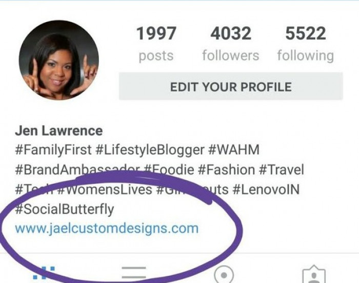
The link is the only clickable way off your profile and into your actual business: the newsletter, the shop, the booking page. A lot of profiles treat it as an afterthought, and it shows.
● The raw, ugly URL dumped straight in, full of tracking gibberish, that looks untrustworthy and nobody taps.
● The permanent "link in bio 👇" pointing at something that hasn't changed in a year and no longer matches what you're actually posting about.
● The link page with fifteen links of equal weight, so the visitor has to hunt for the one that matters and usually gives up.
● No sense of what happens after the tap, click and hope, instead of "read the free guide" or "book a call."
Before: 🔗 link in bio
After: Free 5-day meal-prep guide → tap the link below
The fix: tell people exactly what they'll get when they tap, and make sure the link still delivers it.
The missing call-to-action
Most bios end with a whimper. They describe, then stop, with no instruction on what to do next. A visitor who's mildly interested needs a small nudge, and the absence of one lets them drift off.
There are three flavours of this: no CTA at all, a limp CTA like "check out my page" (they're already on it), and the overloaded CTA that asks for everything at once, so follow, subscribe, shop, DM and book all land in one breath. Ask for five things and people do none of them.
Pick the single action that matters most right now and ask for only that. One bio, one job.
The fix: end with one clear, specific instruction, not zero and not five.
Highlights that undermine the bio
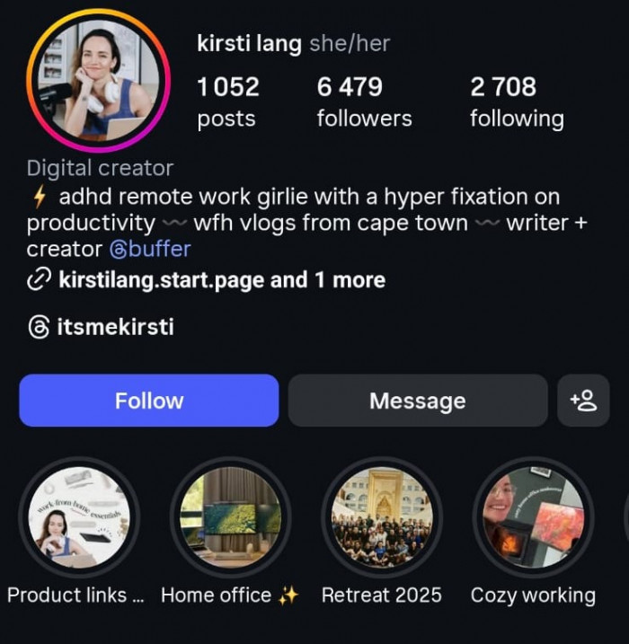
People polish the bio text and forget that the row of highlight covers directly beneath it is read as part of the same unit. A sharp bio sitting above a messy highlight row is like a clean shopfront with a cluttered window.
The usual offenders: mismatched covers in five different styles, highlights nobody has touched in two years, and no logical first highlight, so the leftmost one, which gets seen most, ends up being something random instead of "Start here" or "What I do."
Highlights are a second chance to answer "what's in it for me?" Treat the first two or three as an extension of the bio, not a scrapbook.
The fix: give your leftmost highlights a job, like "Start here", "Services" or "Reviews", and keep the covers consistent.
Trying to be everything to everyone
This is the positioning mistake, and it's the scariest to fix because it feels like cutting off opportunity. The logic goes: if I mention fitness and travel and photography and mindset, I'll appeal to more people. In practice, a bio aimed at everyone lands with no one.
Specificity feels risky but does the opposite of what you fear. "Fitness for busy dads over 40" doesn't shrink your audience, it makes the right person feel seen and instantly decide you're for them. Vague breadth gives nobody that jolt of recognition.
Keyword soup is the same mistake in disguise, stacking "coach | speaker | author | investor | foodie" to cover all bases. It reads as someone who hasn't decided what they are, and undecided is hard to follow.
The fix: narrow the bio to the one person you most want to reach. The right people will feel it.
When the bio and the grid disagree
A bio makes a promise. The grid is the proof. When the two disagree, a visitor feels it instantly, even if they can't name why, and that small sense of being misled is enough to lose them.
The bio says "minimalist interior design" but the feed is selfies and quotes. Or it says "daily tips" and the last post was six weeks ago. The gap between what you claim and what you show is a quiet credibility leak, because people trust the evidence over the caption.
Alignment isn't about a perfect feed. It's about the first few posts a visitor sees backing up the thing your bio just promised, so both halves tell one consistent story.
The fix: make sure your top row of posts visibly delivers what your bio claims.
The mistakes at a glance
Before the final move, here's the whole teardown in one place, so you can scan your own bio against it line by line:
| The mistake | What the visitor thinks | The fix |
| Diary-style bio | "Nice, but what's in it for me?" | Write for their payoff, not your identity |
| Empty Name field | Never finds you at all | Add a searchable keyword |
| Vague first line | "Could be anyone" | Place them in one clear line |
| Emoji wall | "This feels amateur" | Keep only emojis that do a job |
| Dead or messy link | "Not worth the tap" | Name the destination and keep it current |
| No call-to-action | Drifts off | Ask for one specific thing |
| Trying to reach everyone | Feels like it's for no one | Narrow to your one person |
The verdict: read it like a stranger will
Here's the move that catches most of these at once. Open your profile in the mindset of someone who has never heard of you, found you ten seconds ago, and owes you nothing. Read the bio cold and ask three things: do I know what this is, who it's for, and why I'd stay?
If a line can't survive that cold read, if it describes you instead of helping them, decorates instead of clarifies, or promises something the grid doesn't back up, it's quietly costing you follows you'll never watch leave. Your bio isn't about you. It's the three seconds you get to prove a stranger should stay, so write it for them, and earn the tap.